Can’t decide between gray and beige? Maybe you don’t have to, now that greige is the trending neutral in interior design.
Greige is really hard to describe because it’s so similar to some shades of gray and to some shades of beige. It’s really an in-between color, so it’s hard to define where greige begins and ends on the neutral color continuum. Even the name greige is a combination of the words grey and beige! It’s pronounced like beige but with a “gr” sound at the beginning.
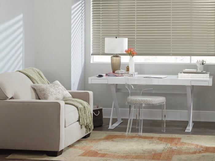
(IMAGE: The greige arm chair, window treatments and rug add warmth to this home office.)
Greige ties your color scheme together
One thing is certain. Greige is a pleasing and flexible neutral for home design elements that goes with most any palette. The color extends from quite dark tones, almost charcoal in look, to the lightest taupe hues and from cooler to warmer shades, depending on the ratio of gray to beige in the mix.
Greige ties together other neutrals, such as white, cream, tan, black and grey tones. This fabulous color also plays well with splashes of both bold and subtle hues, allowing other colors to pop. Because of its soft, neutral tone, greige brings disparate colors into a harmonious whole.
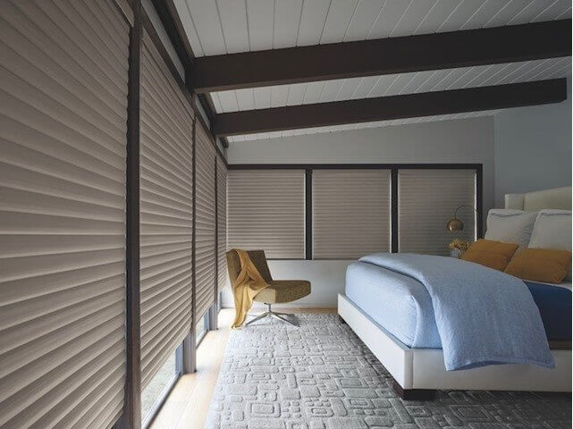
(IMAGE: In this bedroom, the greige-colored window treatments allow the blue and yellow accents to pop.)
Where to use greige
This soothing color works well in just about every room and for almost any surface, including:
Soft upholstery fabrics and rugs
Hard flooring surfaces, like tile and stone
Counter surfaces, including granite, quartz, marble and laminate
Wall surfaces, such as paint and wall coverings
Bed and table linens
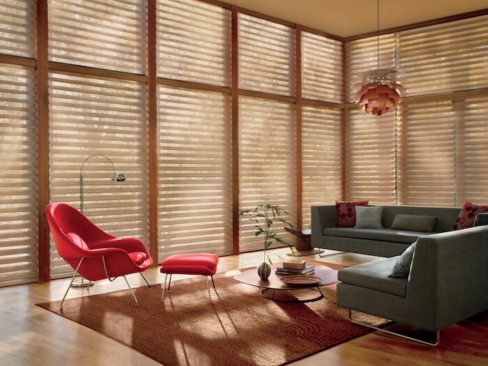
(IMAGE: Greige pairs well with other neutrals such as white and gray.)
Add versatile greige to your color palette this season!