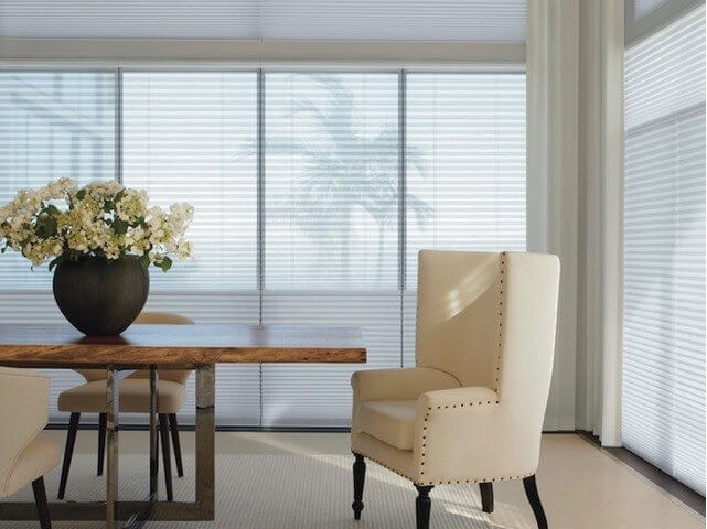
Call this color what you like – buttercream, whipped honey, straw, pearl, or linen – it’s a flexible shade for home decorating that’s bright and sunny, creating warmth in a room.
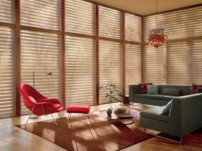
Like other neutrals, buttercream lets accent colors shine and makes your artwork pop. But it’s warmer and more inviting than pure white or barely off-white. Buttercream has many subtle versions. True buttercream has a yellow undertone; other versions have touches of pink, grey or peach.
The color buttercream lets your accent colors shine.
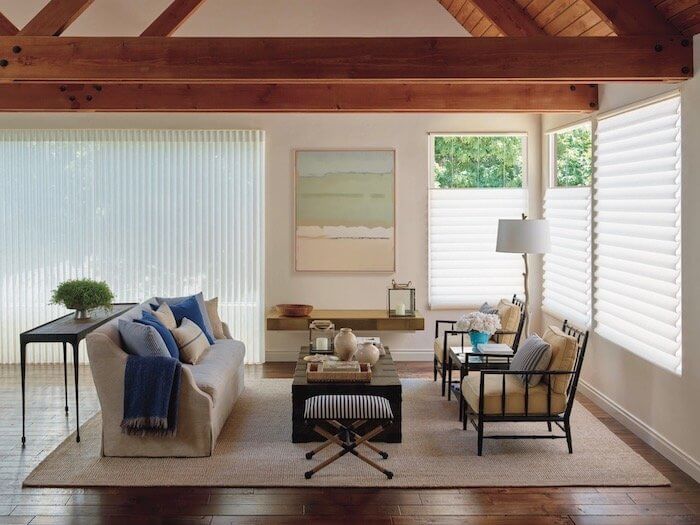
Buttercream pairs especially well with dark wood furniture.
A Flexible, Relaxing Neutral
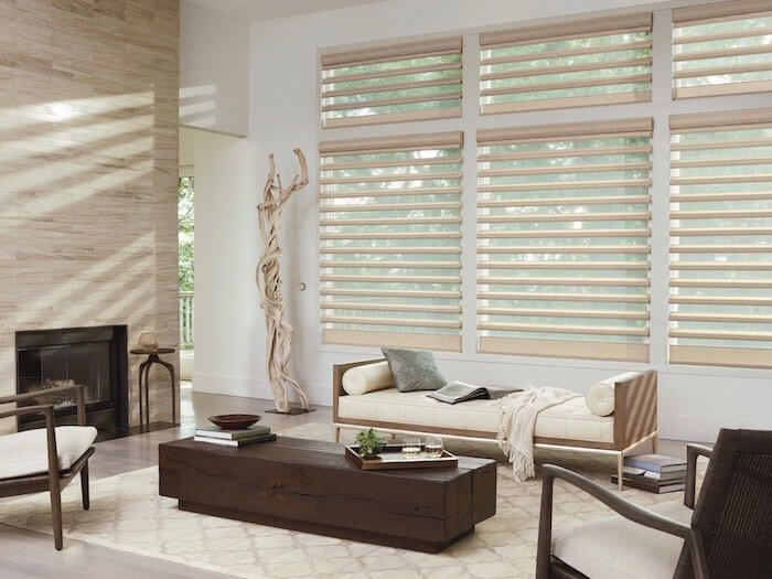
This versatile neutral goes with both warm and cool colors, pastels and bold tones. It also pairs perfectly with black, white, gray and various tones of brown, especially dark wood furniture, flooring and cabinets.
Buttercream is a soft shade that makes you feel relaxed and serene, and it won’t go out of style. It shines in most any room of the house and can go casual or formal, traditional or contemporary. In a bedroom, home office or library, you can even go with a slightly deeper shade of cream to create a cozy feel.
Where to Use Buttercream
Consider the color cream for:
Paint
Carpeting and rugs
Stone surfaces
Upholstery fabrics and pillows
Window fashions
Cabinets and counter tops
Bedding
Table and bath linens
Add buttercream this season to your decorating plans. It’s a delicious color for heightening your home décor.